Wednesday, March 18, 2009
Yale Revisted ( pt 2) paper #4
Since I've already visited Yale Art I'll only talk about a few things I enjoyed there.... Like the center for British Art, across the street, Yale Art is a modern building. It has, throughout, a concrete coffered ceiling and black marble tile floors, and low lighting with respect to the actual art which has spotlights. And unlike the other gallery, it has floating, colored walls in each gallery that seem to reflect colors that would be found in the culture of the exhibits. For example in the Asian Arts wing some of the walls are painted a rich navy blue, taupe, and a particular shade of red, where as in the modern collection the walls are a light gray and/or white, the early European secton is signified by it's wine colored walls.
I started, again on the top floor which is the Picasso exhibit that I loved. There were drawings, paintings, illustration and sculptures. I figured out, after looking at a photo of Picasso, that most of his figures share the same profile as him. It's an interesting group of things here, set in a Red and Teal walled room. In between the gallery was a little walkway with a collection of poems and text collaged onto small paintings, illustrations and some sketches. He did a small postcard sized drawing of just faces which I enjoyed so much that I bought the postcard. I also really loved this simple drawing Head of a Woman, which is the subject of numerous pieces, but this one is done in gouache and ink, there's nothing spectacular about it but it is one of my favorites in this collection, along with a painted steel sculpture of the same subject.
On to the 3rd floor for the Early European and modern collection. Now because I just came from the British Center, I decided not to spend any real time in the Early European collection. I did however notice how some of the early European religious paintings which are very close in imaging to the Ethiopian christian art and some of the other earlier paintings gave me a feeling of surrealism. Other than that I didn't really care to re-examine anything that I haven't seen before. I think it would have been overkill, but it is a very nice gallery.
On the other side of the 3rd floor gallery is the permanent modern collection. In it I was pulled in by a Stuart Davis oil painting titled Combination Concrete #3, which I read is an ode to Jazz. And I can clearly see that in the way Davis positions his figures and the colors. It has so much movement. The yellows pop and retract, the black contrasts the white, the white contrasts the blue, it's doing so much. You can stand in front of it for quite some time just trying to figure out where he started. I've had to do a Stuart Davis like painting for a class and it was a fraction of the size and still very complicated, so I can only imagine how much work was put into this almost 5 x 3 ft painting. It's a seemless collage of color and shapes.
Across the hall on the same floor was another visiting exhibit of modern art. Again white and light gray floating walls, light wood flooring infused with concrete structure. Here, in this hall, were a few wonderful and disturbing things. What caught my eye immediately was a man sitting on the floor, sleeping. What I didn't realize is that it was a figure, a drug addict. It was so ridiculously realistic, and just the thought of him there, overdosing, bothered me. Also there was another piece title the unborn. A very gray abstract, very textured. On it were little silver-ish lab jackets that were sometime filled with or had a trail of a plaster looking substance (an unformed fetus?) and numbered to signify the unborn, and again the idea of them were disturbing. Moving on from these pieces another strange but interesting piece, a sculpture, caught my eye. It was a pure white alien looking figure by Alberto Giacometti called Hands Holding the Void. I really liked this piece. It put me in the mind of a science fiction flick, something where they would have frozen the alien in the middle of his actions. The expression on his face seemed as if he lost something and he was also devoid of color and life, the title was very fitting. Backtracking.... I didn't however understand an exhibit of a hanging shovel on the other side of the gallery. But they were mostly pretty intersting stuff where in most you can see the connection and others leave you lost. Another one to see here is the Basquiat, just because he's one of my favorite artists.
On the Second floor are the Asian and African art galleries. Lots of wonderful masks, pottery, tapestries, armor, carvings, etc. In the African wing there is this beautifully beaded piece of a bird, it is so vibrant and intricate. The set up is very simply laid, here though are plum, gray and moss colored focus walls, which are very earthy tones, like those that may be found in Africa. There is also a nice center exhibit of a headdress set against enlarged photos of a ceremony. It was heavy looking and meant to wear over the shoulders. Across the hall is the Asian exhibit, again here there are colorful focus walls. I love Asian art so I spent a little more time here, and I've grown up with alot of African art much like that which was in this gallery with the acception of some of the pieces. But in the Asian wing were some beautiful pottery, scrolls and statues. An enchanting display of war armor which was seating and staring right at you. Here I found a little ivory carving amongst a few others, it wasn't the smallest carving of the bunch, but the most interesting.
The closing of my visit was with the Japanese Tea Culture exhibit. A intimate collection equipped with its own recreated tea room. The focus here was of all of the little intricacies that go into a Japanese Tea experience, the small cups and kettle, bamboo flooring, simple setting, candles and Kimonos; one of which they had and it was so beautifully quilted.Overall this was a great way to spend my three hours ( between the 2 museums). I really gave myself to the exhibits this time and it was worth it.
Tuesday, March 17, 2009
YALE REVISITED (paper #3)
Today I took the time to visit the Yale Center for British Art and revisit the Yale University Art Gallery, starting with the British center. You can almost walk past the building because it blends in with the remainder of what's around it, it reminds me of an office or apartment building and had you not been paying attention you could overlook it. The gallery is located across the street from Yale Art, its a concrete modern structure, very cold looking; externally. The main lobby is very simple and sleek open room with tiled floors and maple wood walls. I chose to start my visit at the top floor gallery which houses most of the classical art. Large and medium sized oil paintings with gilded ornate framing, and a few sculptures and busts are placed here. The gallery is very uniform, beige fabric and maple walls and blinds, light carpeting and lots of natural light from the windowed ceiling. When you approach the gallery from the elevator you feel like you're in someone's home. Most of the art in this gallery was, initially, of no interest to me. For the most part the colors were dark and the subjects were the same. Lots of commissioned portraits commemorating or paying homage to some aristocrat or military official and landscapes. Surprisingly I found a few paintings that I really enjoyed there. The first, a nautical scene, Vice Admiral Sir George Anson's Victory off Cape Finisterre by Samuel Scott. Now it isn't the painting itself that I particularly like but the frame that drew me in. As a matter of fact I think the painting is ugly and the frame garish and somewhat intimidating, BUT it is interesting. It's designed to match the nautical theme. At the top of the frame is a captain like figure equipped with a looking glass/telescope, swords, daggers, and other features like shells and scrolling seaweed(?). He kind of reminded me of the Davey Jones (Octopus faced) character from Pirates of the Caribbean. Had this been located in someones home, maybe an older home, I'ld avoid it for fear that I might be spellbound or something. Lots of detail to dive into.
Another interesting painting, was an oil painting called The Deluge. Its a large painting in a simple frame, a painting of the perfect storm. I walked past it at first, then I did a double take. It was the red moon that caught my eye, then I looked around at the details of the passengers caught up in these waves. The colors were perfect for the mood, it was terrifying. Its mainly of these engulfing black waves and this small peek of moon, lots and lots of details, it has so much movement. I couldn't imagine being in something so horrible.
The gallery is set on a square that overlooks another open gallery below. Also the Long Gallery is attached on to one leg of the square, in it houses more ornately framed classics , mainly Elizabethan and Jacobean portraits and some landscapes. In this gallery were some beautifully crafted paintings. I've always been amazed at the ability, of artists, to replicate an image.
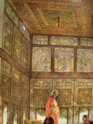
Down on the 3rd floor were the collection from 1850 and beyond. This gallery is again pretty uniform, light beige fabric walls and flooring. It is not an open room with high ceilings like the other, instead the ceiling is pretty standard and the lighting is dim, it is an enclosed gallery. I preffered the art here. Some very beautiful portraits and modern pieces were here, but it was an obvious movement away from the classical works on the 4th floor, I assumed that I would be that. This gallery was not as big as the other, but I spent a good amount of time there. There were quite a few that I loved in this room, but since I can't share them all, I'ld say that The Reception by John Frederick Lewis, Grace Rose by Frederick Sandys and The Irish Girl by Ford Madox Brown were my favorites.
The Reception is so beautiful to look at, it has so many fine details. The tilework, teh stained glass windows, tracery, the lighting and shadow, the reflections on the pool are all done to perfection. Honestly you feel like you can just walk right into the painting. It's more of a painted photograph, it is that incredible. I mean you can even mfeel the haziness and warmth in the picture.
I ended my trip here with the visiting exhibit, Endless Forms: Charles Darwin, natural science and the visual arts. No photos were allowed, so I wasn't able to capture the exhibit. But this was one of the most interesting exhibits I've seen. It seemed to be a study on Darwinism and evolution. The most striking of the series were the photos of the Aboriginies, Africans and other cultures and a collection of drawings of mythical creatures titled The Decent of Humankind. This collection of paintings, drawings, fossils, photos and sculpture, were more of an anthropoligic collection than an art collection, but they were wonderful and worked so well as an art collection. Overall I did enjoy the Yale Center for British Art, and it wasn't my first time there, but now I am able to appreciate the exhibits more. I would absolutely recommend a visit.
Friday, March 13, 2009
The Met / Paper #2
This past Saturday was the ???th trip to the Met and I'm still discovering things. I must say that it is a massive structure and as impressive as its size is alone, its art is equal. I've always loved it there, as a matter of fact I had always planned (as a child) to live across the street, then reality hit, and I realized that I couldn't afford to (lol). Anyhoo you walk up to the Met and you are immediately struck by the size. Its design has that Greco-Roman style facade with columned and arched entrances. If you've looked up, you'ld see the 5-6th century Greek-like busts placed in carved seashells flanked by scrolls and an intricate design. On the entrance walls there are relief sculptures that depict some of the artist in the building and always a crowd of people. Then you enter into the Great Hall.
The Great/ main hall is huge. The three domed ceiling is massive and there's an octogon patterned floor to match the size and spacing of the three domes. Also there are decorative niches that most often times house vases with flowers. Throughout the building itself is very impressive architecture that bring you back to another time. For the most part it is mainly inspired by the Greco-Roman and Rennaissance ages with its columns, busts, niches and vaulted ceilings. Also you will find in the sections that are dedicated to a particular culture, the structure of the space will follow suit. Well we've entered and you can pay your entrance fee at either the left, right or center service desks, behind each is the beginning of a gallery. Directly in front of you, as you're walking in is this "marbled" or carved stone like staircase that is flanked by columns, which naturally draws you in, and each entrance on the sides are also indicated by the massive columns. Just to give you an idea of how big they are, an average person may only be a bit taller than the base of the column. Ok, now you've made it past security and pay either the suggested price or whatever your pocket may afford you, you get your Met pin and you're off to explore. A few things you need to have, a hideable snack ( i.e. small bottle of water and a candy bar or something neat to eat), Patience, stamina and comfortable clothing because there's so much to see.
We then made our way over to the East and Southeast Asian galleries, a place in the museum I've never been, and I LOVE Asian, especially Indian and Southeast Asian inspired art. So this was the place to be! I wish I could share all of the pictures I took. There were so many beautiful things, more sculptures than anything but they were all so interesting. Many depictions of the Buddha and other deities. Some paintings and tapestry, etc. I could really have stayed in the section of the museum for hours just studying the different pieces. At the staircase leading into the upper gallery of the Indian exhibit was this beautifully intricate carved ceiling dome and within the upper gallery red room were smaller artifacts, and other more colorful pieces encased. For some reason it was very hot up there, but wonderful to see.
Within the exhibit were a few pieces that I loved, one of which is a tapestry constructed of aluminum bottle caps, other metal and copper wire in a loosely pieced woven style. As you approach it you see a beutiful tapestry alone, believing that its fabric. It's not until you get closer, much closer that yuo recongnize that it isn't. It's so beautiful to see, and I wish I could touch it. It's comprised of so many individual pieces that it must have taken months to create. It is entitled Between Earth and Heaven by El Anatsui of Ghana, from the Volta region. He's of the people who wove Ewe Kente cloth which is where he is inspired to create this piece. His career spans forty years and he is a graduate of Kwame Nkrumah University of Science and Technology in Kumasi.He's known for creating art out of non traditional materials like broken pottery, liquor bottle caps and driftwood. It was textile exhibit but the pieces were so fitting as art in an of itself. Another of my favorites was an instillation of wax paintings on stretched Kente cloth set on a tangerine backdrop. The Artist Yinka Shonibare created blocks of art in a series entitled 100 Years . Each piece was so vivid and the tangerine color just held it all together. There were other woven pieces that were incredible also. This was a nice end to my trip.
Overall it wasn't surprising, but a very pleasant trip. I always love visiting the Met and recommend anyone to see any of its exhibits. Actually I recommend going more than one within the year so as not to miss anything, since they are always housing something new.
Subscribe to:
Posts (Atom)